Elsa fabric- great when wet….
And then goes purple when dry. But a nice comparison here of why I want the colour:
It’s hard to tell but the colour on the left is more purple, not just lighter than the right.

And then goes purple when dry. But a nice comparison here of why I want the colour:
It’s hard to tell but the colour on the left is more purple, not just lighter than the right.
Cat, wat r u doing? He had just jumped off the balcony…

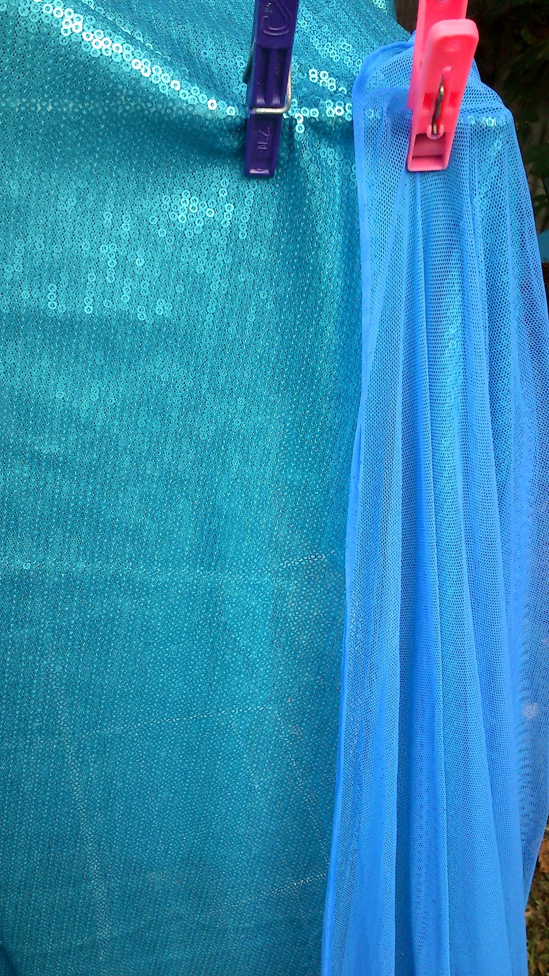
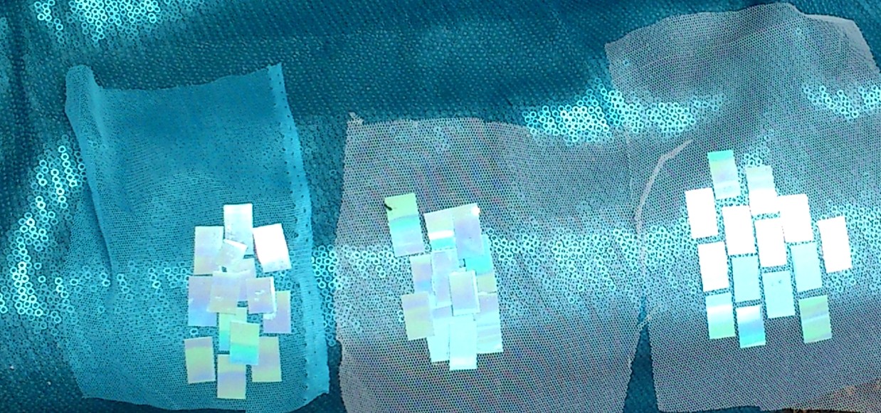
Also the more I look at the sequinned fabric and my own cut pieces the more I like them.

With the darker shimmer sheetz to blend in they’ll work even better. And the smaller sizes 🙂 the pieces are slightly bigger than I want. But at 10mmX20mm I can get 12 across and 15 down per sheet and there are 3 sheets per bag.
This is under eco bulb and very yellow lighting. But the flat sheen of the fabric is so very beautiful in person. It drapes so fluidly due to the sheer backing and flat lined up in rows stitching of the sequins.
The cape is having time out overnight it what is now a foamy frothy mess.
Now, now to look at dino skin impressions or someting.
How to deal with green and purple tinted blues in the same costume:

Veins. Yeah, go bio geekery again? Elsa is fast becoming my hidden nerd costume.
Anyway am guarding the back yard with Mr Behbu. He is certain there are invading feline forces.

Oh. He also looks green. This is because I have looked so long at purple blues for so long that eveything shows up as the contrast. Also being eaten by mosquitoes. Mr Behbu we need to go inside. Behbu? Behbu????
No.
No.
&^%##
Leather dye does indeed work. But it is splashy.
&%$$
In other words I made my Elsa cape purple again. Luckily before I resorted to buying blue acrylic ink (as it does tint very well- though it needs to adhere and the risk of streaks is high when you use water and the risk of flame too great when using alcohol) I decided to use one kettle of not quite boiled water and more than a cup of laundry detergent.
So a small trek back… My poor white and silver Silly Spanish frock was ruined by the cat peeing and the laundry detergent staining. The cat pee washed out but as laundry detergent uses a bluing agent my fabric was ruined. I then soaked the whole shebang in detergent and it mostly worked. But I still had to remove the trim. All 3kg of it so far (about 6 1/2 pounds).
You can see the bluing agent as grain like nodules in the powder- you can buy without but this is more common here. The detergent I used on the Silly Spanish frock was only a warm blue. This current detergent? It’s a mix of cool blue and green. Yes green.
THIS IS AMAZING!
Anyway. So having turned my fabric purple (again) I decided to at least try a super concentrated wash. The water and powder mix was a lovely china blue. Once I put the fabric in it went purple. Which means excess dye is coming out. And now. Well in the green bucket it reads as electric blue. So this is good as it will be worn next to cool blue so if it doesn’t read as purple against very definitely green I am already winning.
So photos of the progress soon. At the moment it’s a bucket full of suds with a wee bitty of fabric poking through.
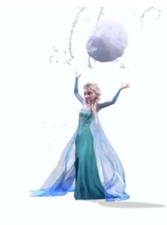
Ummm.. I’m looking at Elsa’s snowflakes and seeing b cells presenting antibodies… IgM is a pentamer but still, I see immunoglobulin polymers even if they don’t exist!
http://en.wikipedia.org/wiki/Antibody
Would anyone notice if I snuck an IgM in there? Pretty sure that’s from a discworld novel- a non six sided snowflake just to see… Discworld Jack Frost is a bit of a grumpy bear really….
‘I resent the implication that I am solely fern fixated,’ said Jack Frost. ‘I can also do a very nice
paisley pattern.’
As Frozen really used a lot of it (especially in regards to the ice).
http://www.huevaluechroma.com/077.php
Please note Warm blue is towards the red and cool towards the yellow. I lot of people get this back to front but yes, a green toned blue is cooler than a “true” blue!
It’s a bit of a human construct but it is how a lot of pigments are made. I used to use Chromacryl and if you mixed a cool blue and warm yellow you got a really muddy green. I need a pack anyway so I may just see if I can get some samples prepped.
Anyway, Elsa’s cape is warm toned. It is however very very sheer so that it really only shows as a shadow. Ufortunately all my dyeing has lead to a much much much too dark blue. It would be perfect if it was a bridal tulle. Very difficult to get. Also I had to go darker because my dye bath apparently dyed unevenly.
(Hello people coming here from tumblr! Just as an update- I am waiting on an order of similar width sequin film to test for durability and ease of use. I keep having on and off issues with being able to scratch the Shimmer Sheetz however the colour is so perfect.. So I’m also going to attempt to tone the sequin film. )
I also have an updated list of all sequins I tested:
http://www.arrayedindreams.com/costume-portfolio/fantasy/frozen-elsa/frozen-elsa-sequins/
The methods will be the same though I need a new paper trimmer as the blade has escaped and I am short sighted enough to not be able to find the inch wide bright orange piece of plastic it is attached to! I hope that the heavier density of the sequin film will allow me to sand the corners smooth as well.Elsa is semi on hold while I work out my Maleficent
DragonsDemonsDaydreams but I’ll update methods here regularly, including any new glues.http://www.arrayedindreams.com/2014/03/28/my-josyrose_tweet-sequin-film-arrived/
So very similar but a little more durable.
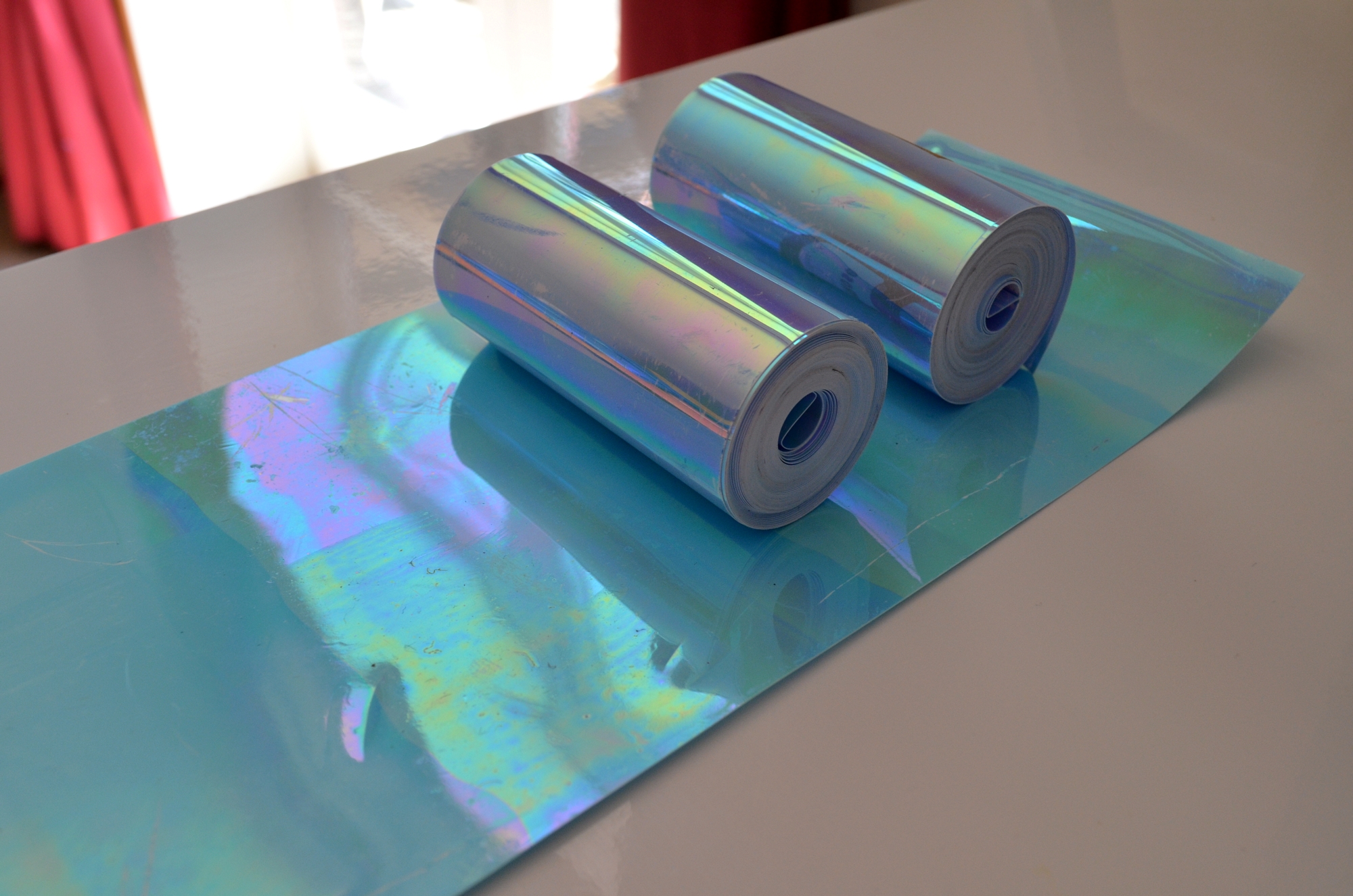
No, not hard core stamped metal but I finally got cutting of my Shimmer Sheetz:
Shimmer Sheetz are produced by Elizabeth Crafts.
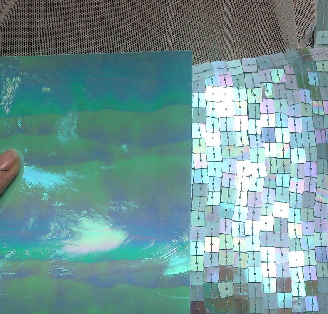
I have just ordered Turquoise as well because I think the two together will give a good gradient to the bodice. Here they are in action:
I was really worried the blue iris was too flat in colour but I also suspected that once cut the effect would be greater. And it was. These tests didn’t even use all of the three strips I made from one sheet. Each strip is 1cm wide then cut to about 1.5-2cm with a few irregulars. I have five packets of three sheets so I should have more than enough 🙂
I’m gluing to net as I can increase sticky from underneath if need be.
The process to make them is as follows:
I scuffed the Sheetz on the reverse, this is to ensure the glue adheres. Not only is the iridescent layer laminated and so prone to pulling away but the surface is shiny. This means even the best glue it not going to grip unless it welds through- and that will lead to warping.
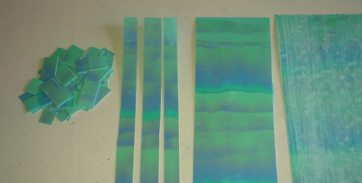

Then I cut the sheet in to 1cm wide strips with a handy line cutter. I am going to invest in a better one, but this was enough to get a feel for how it will cut.
Then each strip was cut into shorter pieces. Preferred length is 2cm so this gives 180 larger sequins per sheet. So 540 per pack.
At this stage I will sand the edges into rounded shapes. Not only because the artwork shows this but also to eliminate any potential extra snagging.
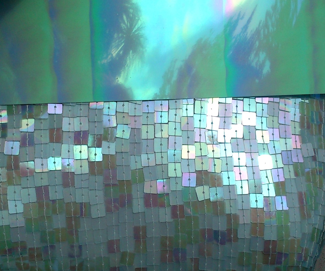
In the below with flash is on the left, without on the right.
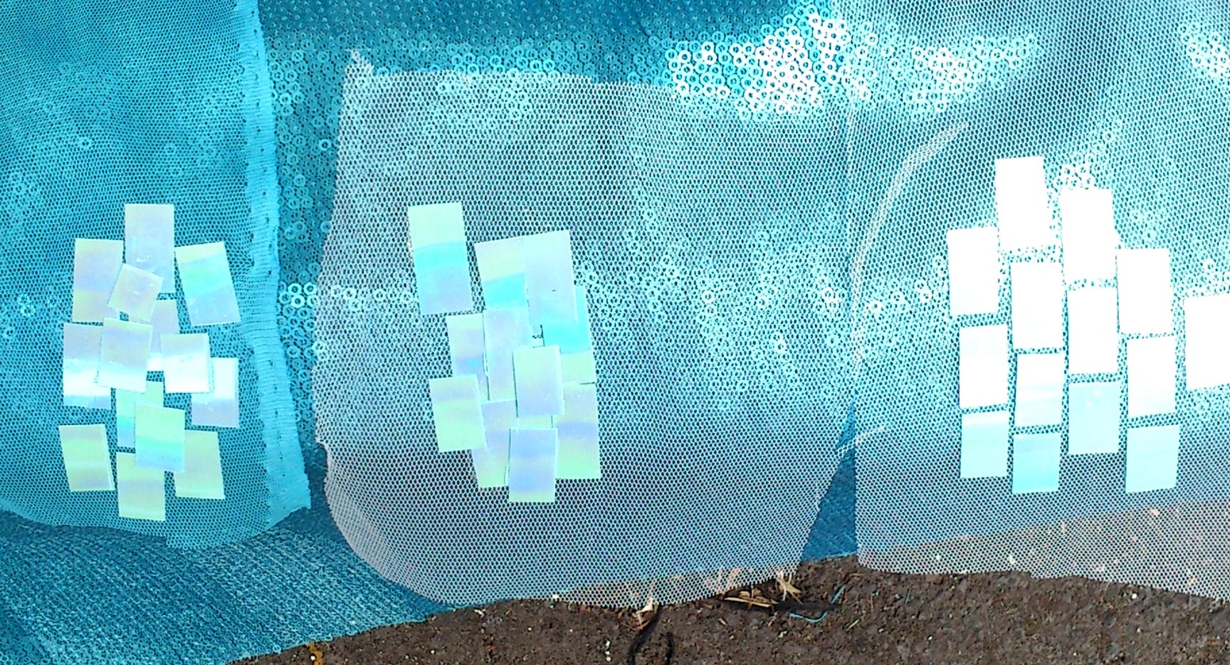
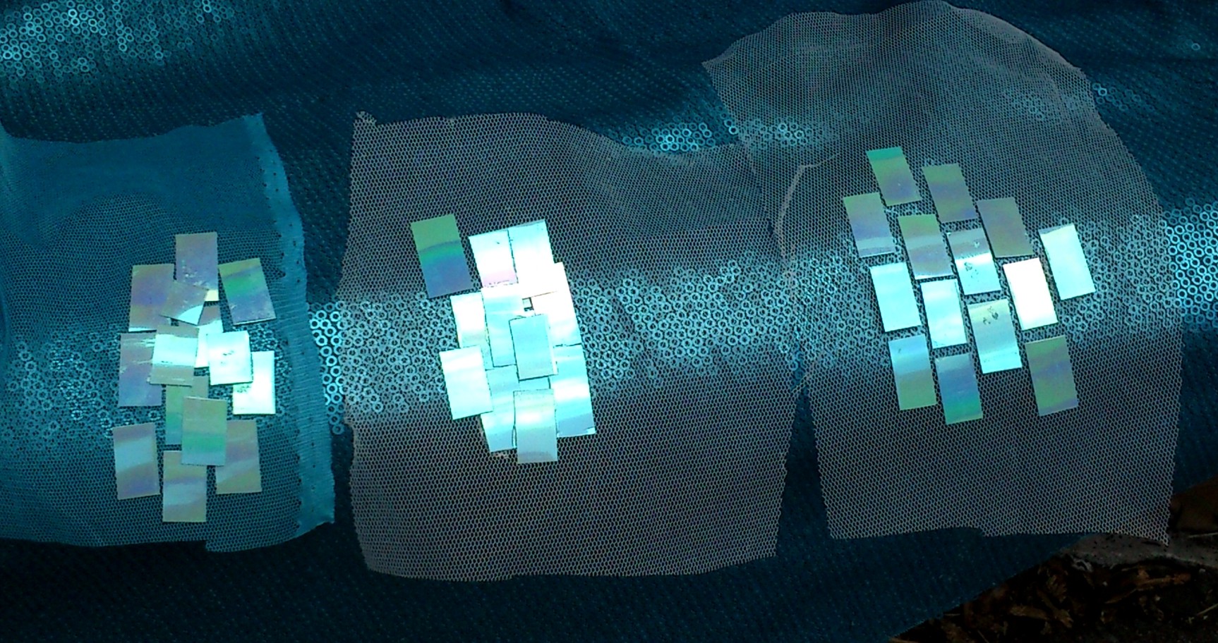
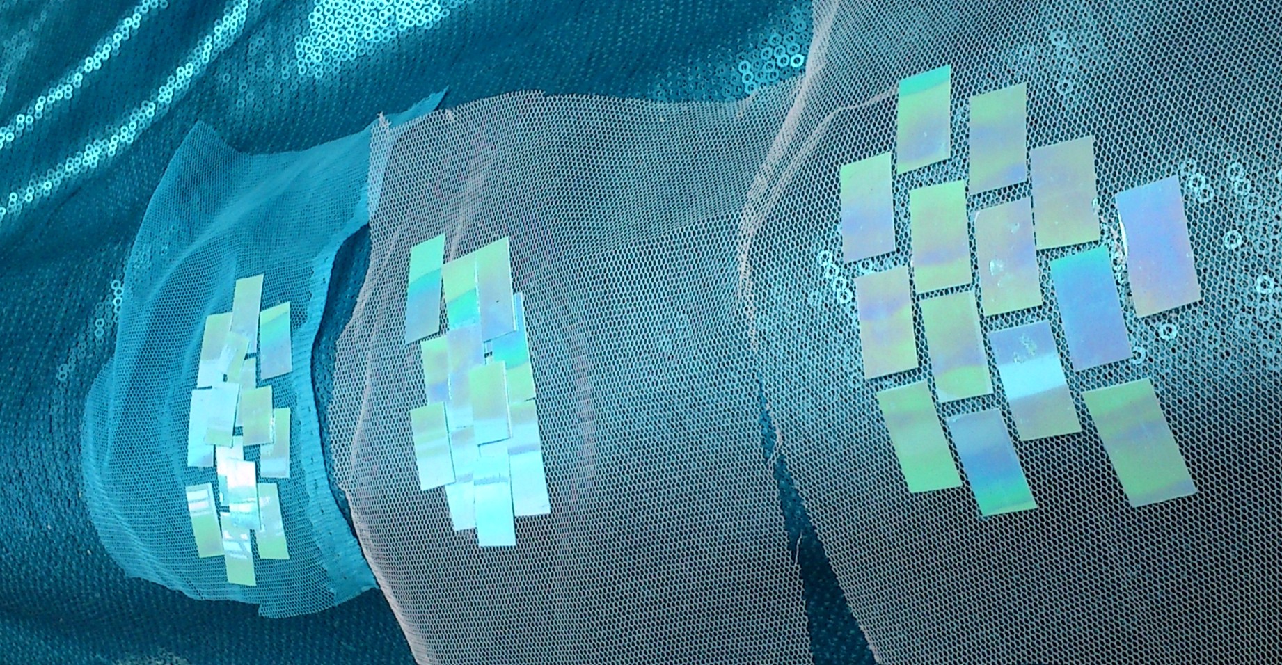
I glued the pieces to two different kinds of net (the net of the sequin fabric and the old net for the cape). I tried irregular overlapping and I tried an open pattern. I prefer the open pattern, the shine really kicks through and the outlines of the background show up.
To glue I picked up each piece with angled tweezers and swept the underside over the end of an open tube of Shoe Goo (Same for E6000 or Goop) then laid and pressed the back in to the net. I used a sheet of styrene inderneath (would prefer waxed paper or sheet silicon to prevent sticking but also to allow the piece to lay flat during curing. I’d also like a roller to press the glue evenly.
So I tried from other angles and with and without flash to capture the effect.

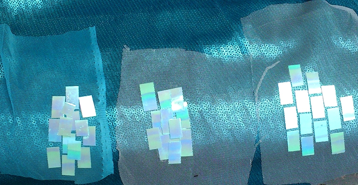
Below are samples of the Sheetz with clear AB pale blue sequins and the base sequinned fabric.
Lined up vertical and horizontal to see which way works best.
All the fabrics before any alterations.
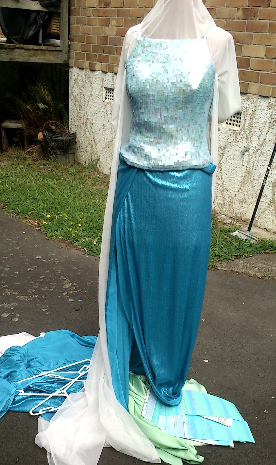
And finally just the intersection of cape, shirt and bodice and why I wanted power net and rounded edged sequins! There is a lot of friction there!


I checked this image in PS and in Win8 Photogallery. My monitor has the wrong profile assigned so all my images in the view look warm toned (on the right). As the screen cap looks the same in PS and in my browsers, my older program and in thumbnails… It is clear the Photo Gallery colour is wrong.
And now I can be happy knowing all my programs show true to color (as I can) as I have an amazing monitor and graphics card 😉
Other sites gave some fairly off information, this is bang on. And clearly an issue not addressed in further Win7 updates and not even in Win8- luckily a super easy fix. I have calibrated and also altered my monitor- calibrations via the OS and the buttons on my monitor. I actually aim for slightly cool tones so you can imagine how annoying this issue has actually been.
Win8 shows the thumbnails the correct colour but there was like an fffff1 mask over the top.
My netbook has V.Lux and even during the day colours are warmer. And our TV definitely tone stowards the cooler- and specifically to make true white look slightly cool purple. I’m mostly using my phone as I can get immediate feedback about how real life looks and then I can compare and adjust my monitor.
Anyway I’m not even going to go too far in to why I think red and blue are particularly troublesome for graphics (I’ve know for at least 15 years this was an issue with digital cameras (I worked for a car magazine and the swears I heard when trying to get a blue car to look right on screen and on film and at the printers…..) It’s a bit of a degree level thing to really study but here, have a spoonflower quick explanation as it is nicely and easily understood:
http://help.spoonflower.com/customer/portal/articles/993494-more-color-for-the-advanced-user
Basically RBG (Red, green Blue) vc CMYK (cyan, magenta, yellow, black) clashing I think is most at fault. Blue and Cyan and Red and Magenta being substituted or not properly able to be expressed between colour spaces. It may explain the blue-> Cyan and red-> magenta shifts when using flash and “auto” on most entry level cameras.
Anyway, I need a nap (read 24 hours sleep- it’s thing, yay monoclonal antibody therapy!) but my next batch of fabric is already in Honolulu and I won’t be surprised if it lands here tomorrow. Anticipating arrival soon anyway. Tomorrow I may have new buckets to store all my fabrics and projects in (fingers crossed) as I really do like having access to everything. Also multipurpose storage is for the win.
But I am sorely tempted to get the decal.
And hey, working for a magazine meant I got dropped in the deep end of colour theory as it applies to digital media really fast. I was Editorial Assistant at a time when there were both digital and physical copies of.. copy 😉 So it’s a bug to me when people use ultimate colour terms. Now I may just have to see the movie again at yet another cinema because the two screening have shown her dress to be heavily in the green tones. And the same as the short tv shots show on my monitor.
That said I had the same argument over the Slave Leia skirt. It is a warm violet in reality, which is why it looks even warmer on print and old yellowed photos but looks very violet in flash (from exhibits and in the barge scene) but everyone remembers it as a dark wine. My skirt behaves exactly the same under those various media and lighting situations. But in person people think it’s wrong.
They do get an ear ful of colour theory I have to admit 😉 I think people forget I am trained as an artist as well as scientist. And quite widely in both.
Oh geez, now for bed. There are mashmallows and I am giggling every time I nom one.
Sigh I have been having issues with working out what colour scheme to go for. At the cinemas her gown is seriously green. However the promo artwork has been tweaked cooler to the point her sleeves look purple.
So I am aiming for this:
https://www.youtube.com/watch?v=ssVnSg2jwUw
Note how her cape clashes with her dress? Awesome. I am going to go whole hog and try for that. It hurts my brain!!! Warm tone and cool tones should not mix! but well I really like how it does clash and hurt my eyes a bit.
It’s kind of like whole tone scales. It’s weird. But it works if you Let It Go… mwahahahaha.
Also, my second piece of fabric is already heading here 🙂 Hoping like mad I got it right and that my shipping worked out. But yes. 3 yards including fedex was cheaper than two meters of similar but not as good fabric from Spotlight. That said, Spotlight clearance warehouse.. I want to be there tomorrow.. pout pout cry. They may have some furniture….