Tag Archives: elsa cosplay

A few Elsa costume quotes,

So, the frozen art book has a lot of cool stuff. Of note is the tense- everything is written as if it was pre-production. So I’ll add in my conclusions below.

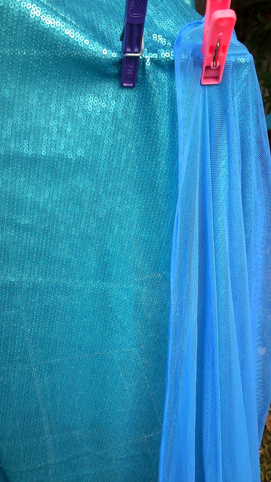
Giaimo put Elsa in a triangular aqua cape decorated with snowflake patterns.

I think this describes the art work which is indeed aqua. The final result is definitely not aqua-except as an overlay of light in some scenes.

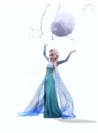
“Elsa’s palette suggesta a beautiful ice crystal,” he explains. “She is a walking effect in the way those colours reflect and refract.”

Yay! Also if you look at the artwork everything that is ice is coloured- usually in the blue shades but even to pink shades. And yellow, even if Olaf thinks it’s a bad colour for snow 😉 Interesting that the yellow is most pronounced when Elsa is attacked.

“I’m attracted to colour schemes that have close analagous relationships. It creates a striking effect.”

With her subtle mauve crew-neck top, paired with her icy blue cape and warm blue dress, Elsa’s colour palette is exquisitely harmonious.”

There is a lot of info here. Colourwise this confirms her sleeves are mauve (they tint to aqua at the wrist- it’s incredibly marked in some promo artwork and washed out in others. This is why promo-artwork can be a bit of a mixed bag- the models are rendered and then there is further editing to alter colour, proportions, add more hair etc. Like you expect in image processing for real people as well.
But the colours of the cape and the dress are reversed in the final model for the film. When you look at the artwork this is indeed the colour scheme even if it is hard to see the dress underneath! (and as per the new link below from Brittney Lee, the colours are reversed for her final design).
Also interesting to see how the sleeved undershirt is defined as having a crew neck. A crew neck is supposed to fit to the neck, Elsa has a dropped shoulder/nearly off the shoulder neckline.
 

For Elsa’s cape, they want to have a crisp, almost unrealistic triangle shape to it. Gravity would probbaly dip the cape down, but they want to pull that off and not have it feel distracting.
-Wayne Unten, supervising animator

Which explains some of the rigid animation is scenes inside her palace of ice vs how it is almost in free fall towards the end of the film.
 

Early on, Mike put Elsa, once she is the snow queen, in this stunning lace cape made out of ice. That cape set the bar very high for a design sensibility, particularly for Elsa’s world, that was very beautiful but also very modern.
John Lasseter in the Preface

We have normal ice.. there there’s Elsa’s magical ice. There are two different sets of shapes and colours. Deep ice has really strong blues as opposed to thin ice, which is greys and whites.
-Cory loftis, visual development artist.

So we have Elsa’s gown and cape as deep ice and the decorations as light ice. I think we kind of know this if we’ve had a chance to see icebergs or glaciers in person or in good photos  Just nice to know this is probably part of the inspiration and thought process 

We also came up with the idea of Elsa having a signature snowflake shape. If you saw it anywhere in the movie, you’d know it wasn’t nature, it was her.
-Dan Lund, effects artist

Michael Giaimo used the word panache to describe the design sense on Frozen, and that’s Elsa to a T, stylish original, and confident. From the column dress with leg slit and train, to the ethereal frost cape that needed to be magical yet believable, to her gorgeous almost flame licked hair.
-Keith Wilson, sim lead.

Many of our samples came from the Disney Parks costume division in Fullerton, California, where we got further education and recommendations. This collaboration translated directly to the walk-around costume interpretations for Disney’s Theme Parks, when that time came. It really helps when a studio has those kind of extensive resources!”

Costume Design in Animation – Disney’s Frozen – Tyranny of Style

So yes, yes it is possible to look at the park costume and use some of their samples for ideas 

(reposting from my rpf thread 🙂 ) And adding in some quotes from Brittney Lee..

Ahah!

http://britsketch.blogspot.co.nz/2014/02/frozen-costume-design.html

I thought so! Anna does grow up between the incident and the very start of Snowman. Also Elsa has a totally different growth rate, which may also make it harder to tell the age gap between the two.

http://britsketch.blogspot.co.nz/2014/02/frozen-elsa.html

When you have fancied yourself as a bubbly mermaid for most of your life, the realization that you are actually more of a snow queen kind of hits you like a ton of ice-bricks.

This quote is more for me as I too wanted to be Ariel when I was younger 😉 I drew mermaids everywhere.  Also hey, original source!

One of the first assignments I received on Elsa was a redesign of her hair. She had initially been designed with a sharper silhouette, but as her character changed it became apparent that her style needed to be refreshed. …. Oh, and magical – it would be great if it was magical, too.

Elsa doesn’t have time to fuss with her hair – she just freezes it in place and gets on with the show.

And then there is that dress. What I wouldn’t give for someone to ice-magic me that dress. Just like Elsa herself, her dress went through many, many iterations until it finally felt right for our girl. When this dress materializes, Elsa is at her most confident. She is open and free after years of controlling and containing all of her emotions. Since costumes should be designed to support the character, this dress needed to be a glorious breathe of relief.


Leave a Comment

Filed under Uncategorized

Elsa fabric- great when wet….

And then goes purple when dry. But a nice comparison here of why I want the colour:

sm_DSC_2784 elsacatamari

It’s hard to tell but the colour on the left is more purple, not just lighter than the right.

sm_DSC_2781


Leave a Comment

Filed under Uncategorized

Someone can puzzle jump

Cat, wat r u doing? He had just jumped off the balcony…

image

Also the more I look at the sequinned fabric and my own cut pieces the more I like them.

image

With the darker shimmer sheetz to blend in they’ll work even better. And the smaller sizes 🙂 the pieces are slightly bigger than I want. But at 10mmX20mm I can get 12 across and 15 down per sheet and there are 3 sheets per bag.

This is under eco bulb and very yellow lighting. But the flat sheen of the fabric is so very beautiful in person. It drapes so fluidly due to the sheer backing and flat lined up in rows stitching of the sequins.

The cape is having time out overnight it what is now a foamy frothy mess.

Now, now to look at dino skin impressions or someting.

Leave a Comment

Filed under Uncategorized

Sorry for weird photo but…

How to deal with green and purple tinted blues in the same costume:

image

Veins. Yeah, go bio geekery again? Elsa is fast becoming my hidden nerd costume.
Anyway am guarding the back yard with Mr Behbu. He is certain there are invading feline forces.

image

Oh. He also looks green. This is because I have looked so long at purple blues for so long that eveything shows up as the contrast. Also being eaten by mosquitoes. Mr Behbu we need to go inside. Behbu? Behbu????

Leave a Comment

Filed under Uncategorized

No.

No.


No.

&^%##

Leather dye does indeed work. But it is splashy.


&%$$

Leave a Comment

Filed under Uncategorized

Hah! laundrey detergent back in the positive!

In other words I made my Elsa cape purple again. Luckily before I resorted to buying blue acrylic ink (as it does tint very well- though it needs to adhere and the risk of streaks is high when you use water and the risk of flame too great when using alcohol) I decided to use one kettle of not quite boiled water and more than a cup of laundry detergent.

So a small trek back… My poor white and silver Silly Spanish frock was ruined by the cat peeing and the laundry detergent staining. The cat pee washed out but as laundry detergent uses a bluing agent my fabric was ruined. I then soaked the whole shebang in detergent and it mostly worked. But I still had to remove the trim. All 3kg of it so far (about 6 1/2 pounds).

You can see the bluing agent as grain like nodules in the powder- you can buy without but this is more common here. The detergent I used on the Silly Spanish frock was only a warm blue. This current detergent? It’s a mix of cool blue and green. Yes green.

THIS IS AMAZING!

Anyway. So having turned my fabric purple (again) I decided to at least try a super concentrated wash. The water and powder mix was a lovely china blue. Once I put the fabric in it went purple. Which means excess dye is coming out. And now. Well in the green bucket it reads as electric blue. So this is good as it will be worn next to cool blue so if it doesn’t read as purple against very definitely green I am already winning.

So photos of the progress soon. At the moment it’s a bucket full of suds with a wee bitty of fabric poking through.

Leave a Comment

Filed under Uncategorized

Oh dear… my worlds are coliding!

Ummm.. I’m looking at Elsa’s snowflakes and seeing b cells presenting antibodies… IgM is a pentamer but still, I see immunoglobulin polymers even if they don’t exist!

http://en.wikipedia.org/wiki/Antibody

Would anyone notice if I snuck an IgM in there? Pretty sure that’s from a discworld novel- a non six sided snowflake just to see… Discworld Jack Frost is a bit of a grumpy bear really….

‘I resent the implication that I am solely fern fixated,’ said Jack Frost. ‘I can also do a very nice 

paisley pattern.’

Leave a Comment

Filed under Uncategorized

Elsa nightmare mode indeed

The colour of her cape is impossible to get. And harder to dye. I have had electric purple, sea green, dark indigo. And lavender. The lavender is the last go. It’s warm blue during the day.

Now to decide if the nylon percentage will grab a nice pure blue or if it will go more purple or to green which will muddy the tone…

The wall decal also seems a little washed out- her eyes are quite grey on my monitor so it may be a case of hunting out some printed artwork somewhere because this digital matching is not working. There are three distinct colours however so any artwork that doesn’t show this is automatically on the suspected over processing horizon 😉

I am taking in to account lighting- the final scene is perfect as we go from grey washed out white light to yellow daylight. It is very close to how my sequinned fabric behaves, though mine is too dark really.

Sigh. Turquoise idye poly anyone? Bueller? Bueller? I just need to shift this blue slightly in from the purple tone it has. Just slightly. Ever so slightly. Basically it looks great in daylight but under eco-bulbs it is really lavender. The weight of the fabric is perfect though. And so soft. So soft. I maaaaaay be able to use the last sachet of dye enhancer to bring it over the line. I’ll have to test though. Test and test and test.

Yeah, I have it next to some of the power net that went too dark and too green (all the net needs to be warm blue and the solid fabric cool) and it is a little too pale and too purple. Meanwhile the power net, that is the perfect transition colour between the mauve and aqua of her sleeves in daylight, looks like over washed white- that hint of blue from laundry powder and grey from washing with other garments.

Leave a Comment

Filed under Uncategorized

More colour theory

As Frozen really used a lot of it (especially in regards to the ice).

http://www.huevaluechroma.com/077.php

Please note Warm blue is towards the red and cool towards the yellow. I lot of people get this back to front but yes, a green toned blue is cooler than a “true” blue!

It’s a bit of a human construct but it is how a lot of pigments are made. I used to use Chromacryl and if you mixed a cool blue and warm yellow you got a really muddy green. I need a pack anyway so I may just see if I can get some samples prepped.

Anyway, Elsa’s cape is warm toned. It is however very very sheer so that it really only shows as a shadow. Ufortunately all my dyeing has lead to a much much much too dark blue. It would be perfect if it was a bridal tulle. Very difficult to get. Also I had to go darker because my dye bath apparently dyed unevenly.

Leave a Comment

Filed under Uncategorized

Elsa colours

Sigh I have been having issues with working out what colour scheme to go for. At the cinemas her gown is seriously green. However the promo artwork has been tweaked cooler to the point her sleeves look purple.

So I am aiming for this:

https://www.youtube.com/watch?v=ssVnSg2jwUw

Note how her cape clashes with her dress? Awesome. I am going to go whole hog and try for that. It hurts my brain!!! Warm tone and cool tones should not mix! but well I really like how it does clash and hurt my eyes a bit.

It’s kind of like whole tone scales. It’s weird. But it works if you Let It Go… mwahahahaha.


Also, my second piece of fabric is already heading here 🙂 Hoping like mad I got it right and that my shipping worked out. But yes. 3 yards including fedex was cheaper than two meters of similar but not as good fabric from Spotlight. That said, Spotlight clearance warehouse.. I want to be there tomorrow.. pout pout cry. They may have some furniture….

Leave a Comment

Filed under Uncategorized